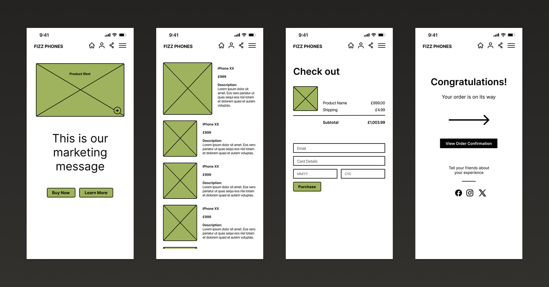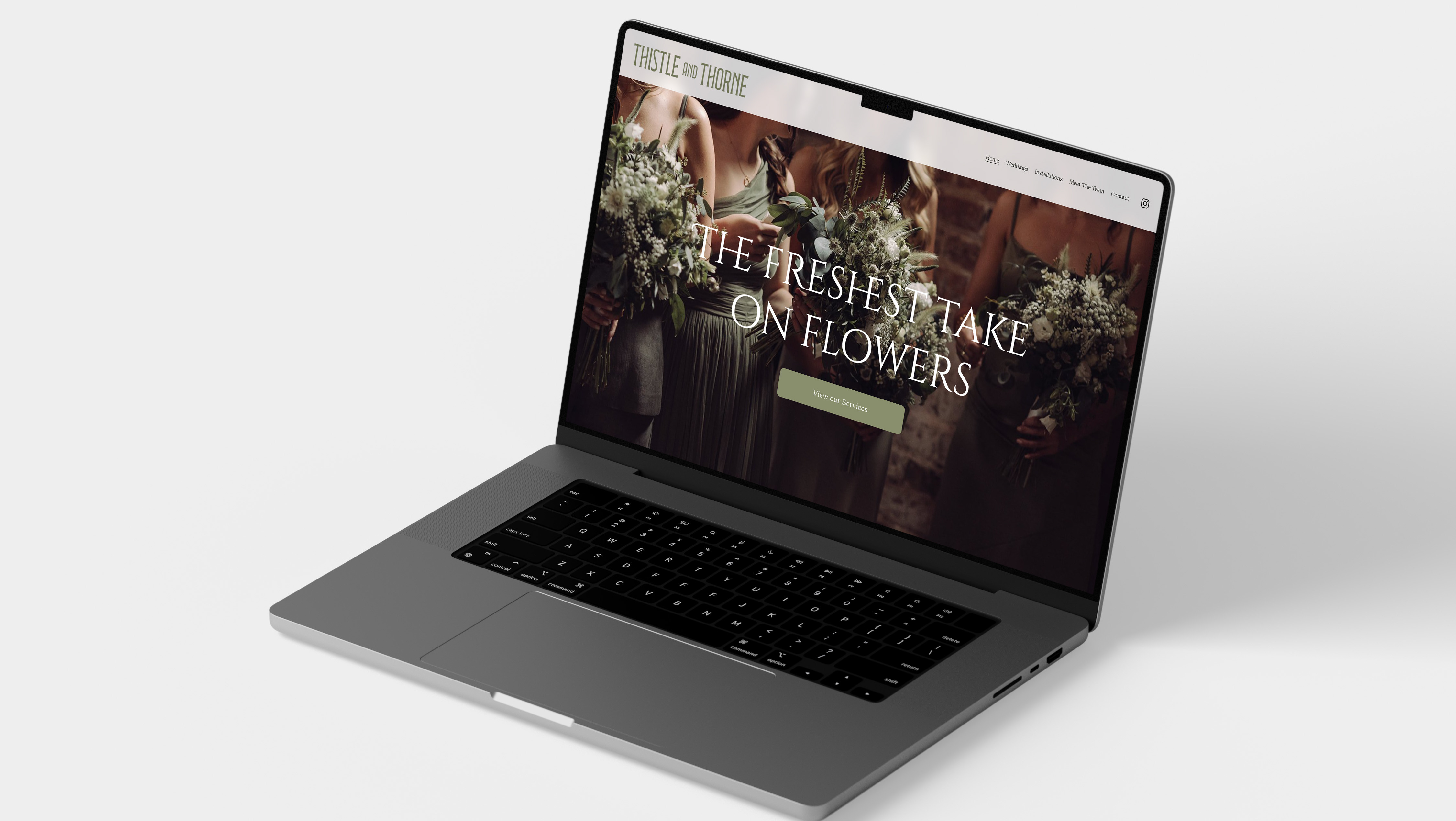
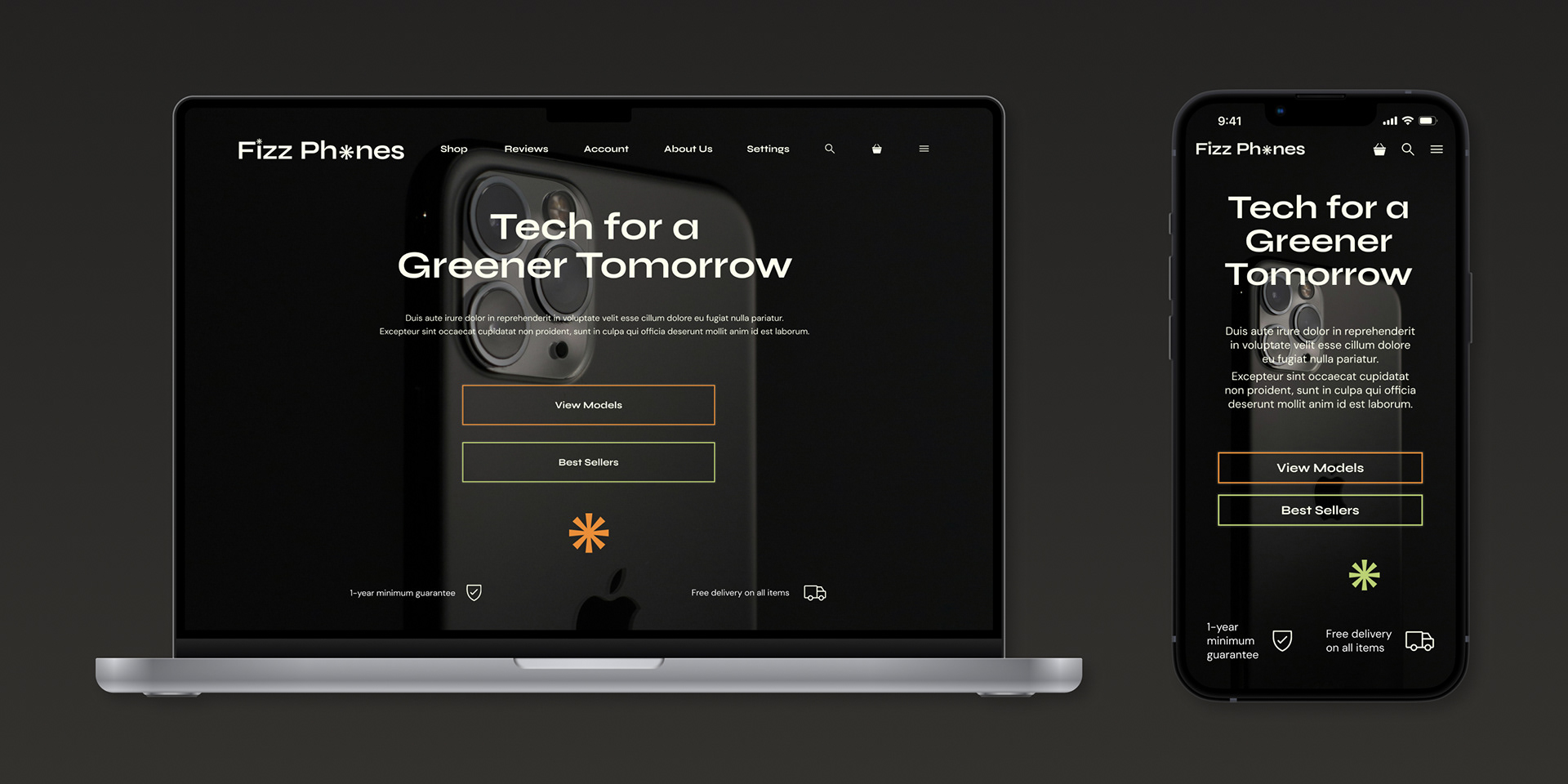
During an online course in UI, I completed a case study.
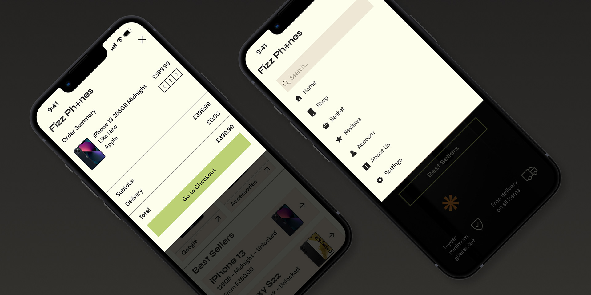
We were assigned a random company and ideal customer. I then began my research. Based on my consumer's needs, I started forming an idea of how the website should look and function. It was important to make the process easy and accessible. They were looking for a no-fuss product that would fit their hectic schedule.
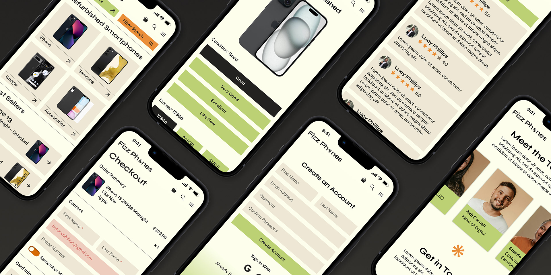
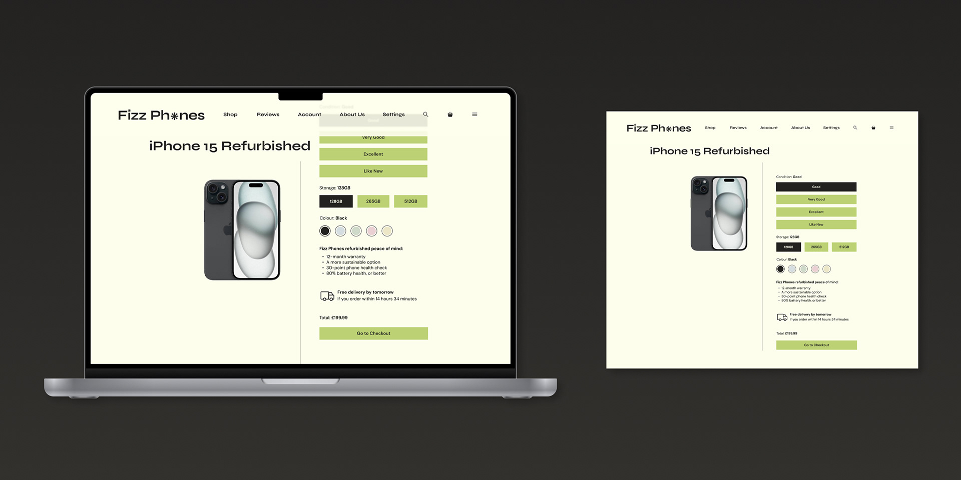
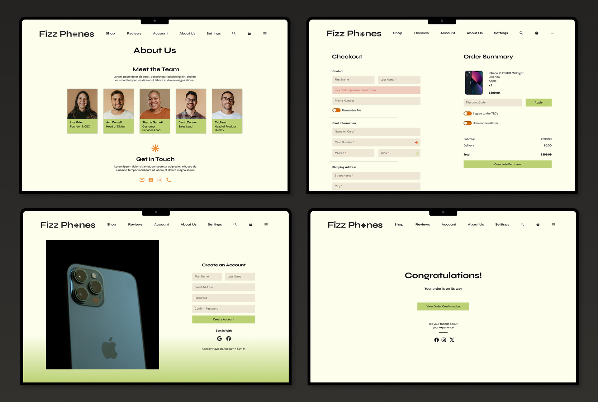
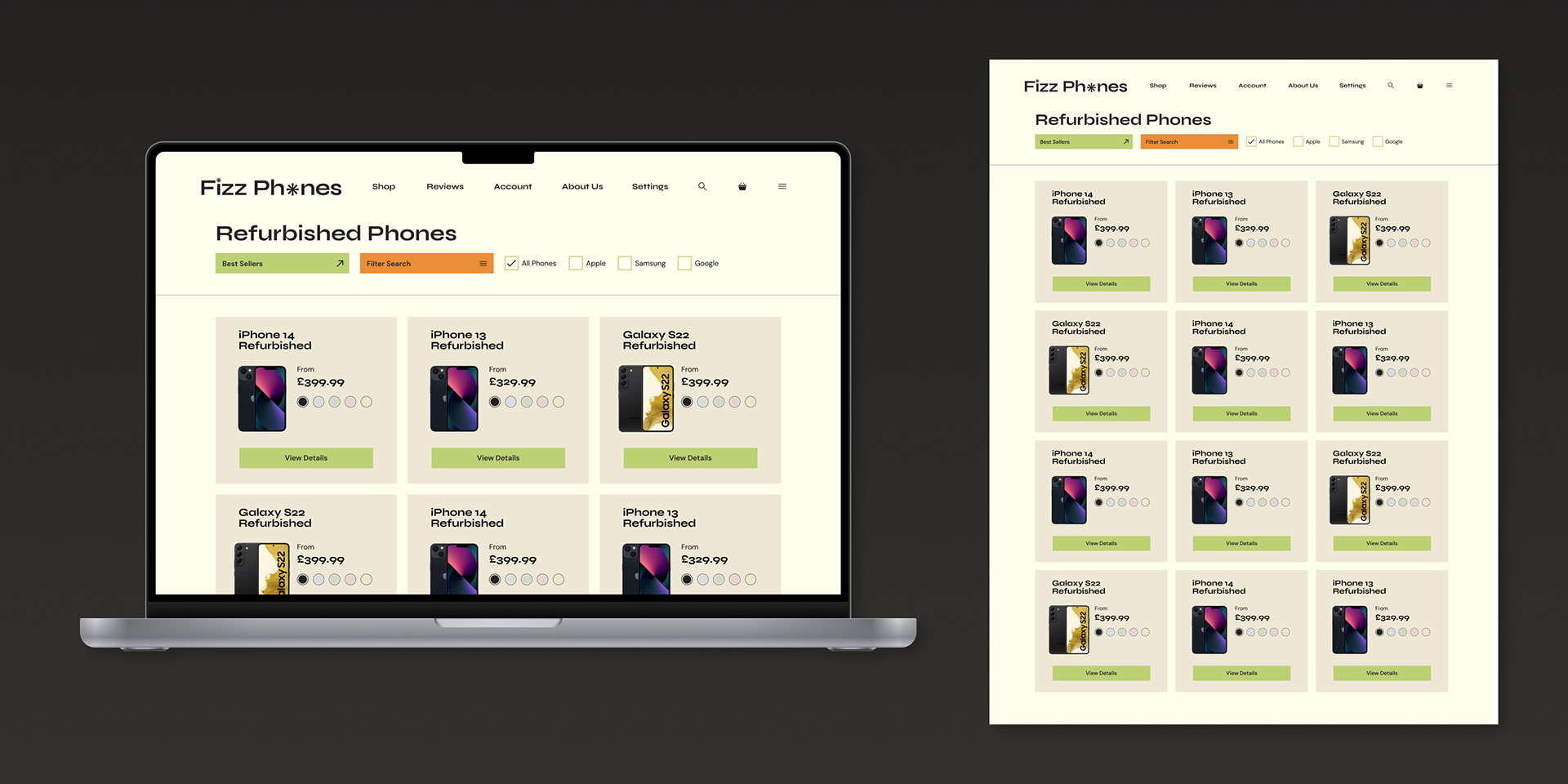
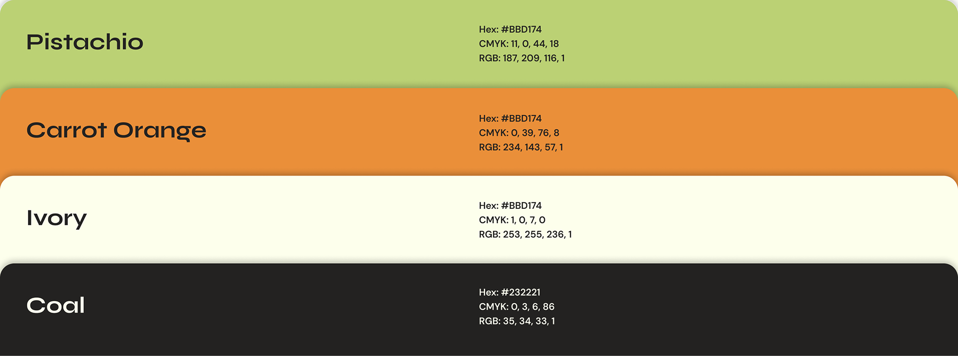
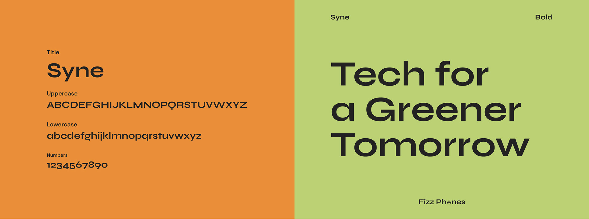
Too often, tech companies are viewed as clinical, with greyscale colour palettes and rigid sans-serif copy. I wanted to inject some personality into my brand.
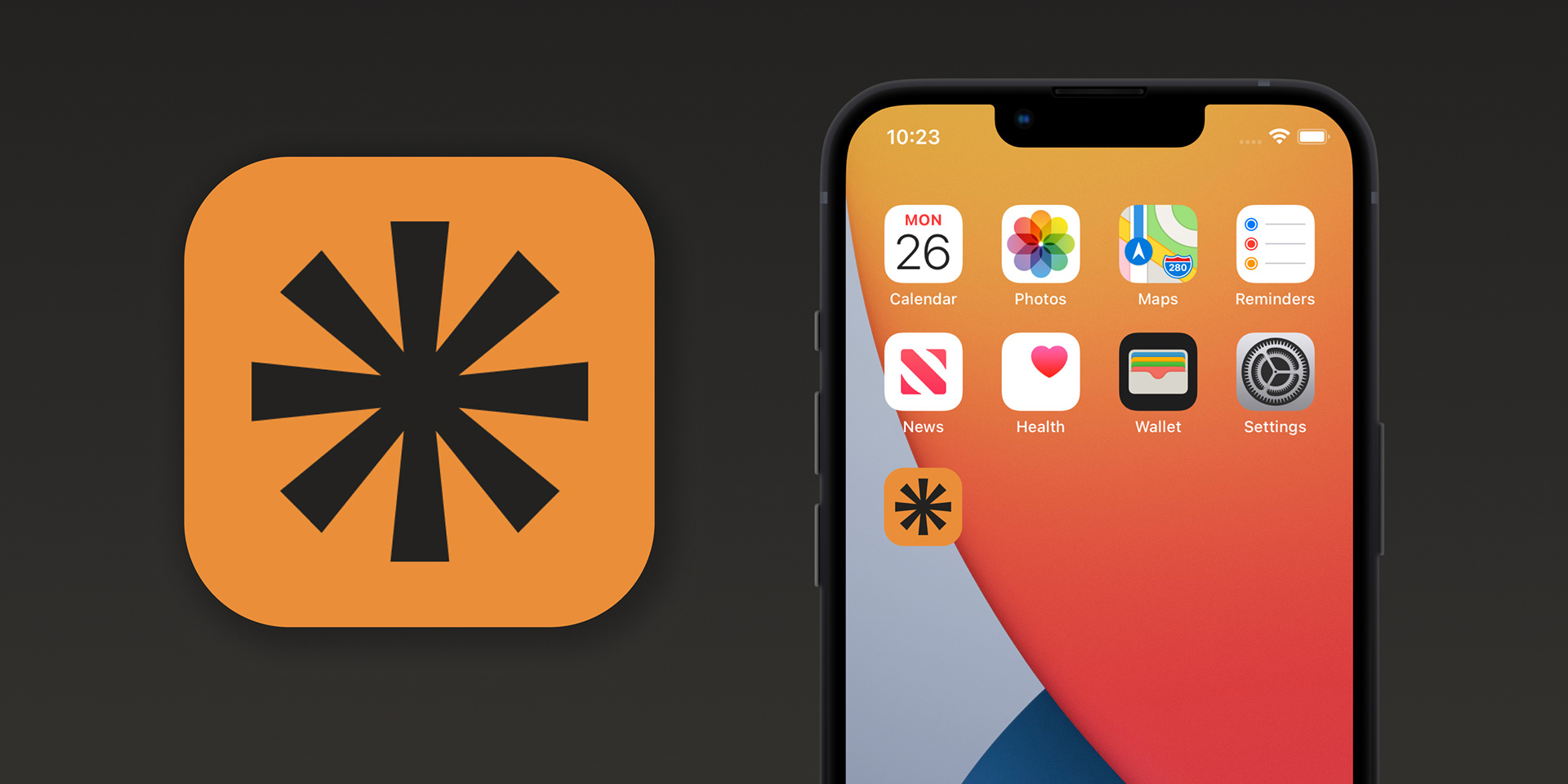
I hope my finished output inspired a sense of both humanity and trust. The website has its quirks, with small animations and varient interactions. In a market that so frequently ignores these elements. It was exciting to prototype the 'what-ifs' designers often consider. I am happy with the result of this case study.
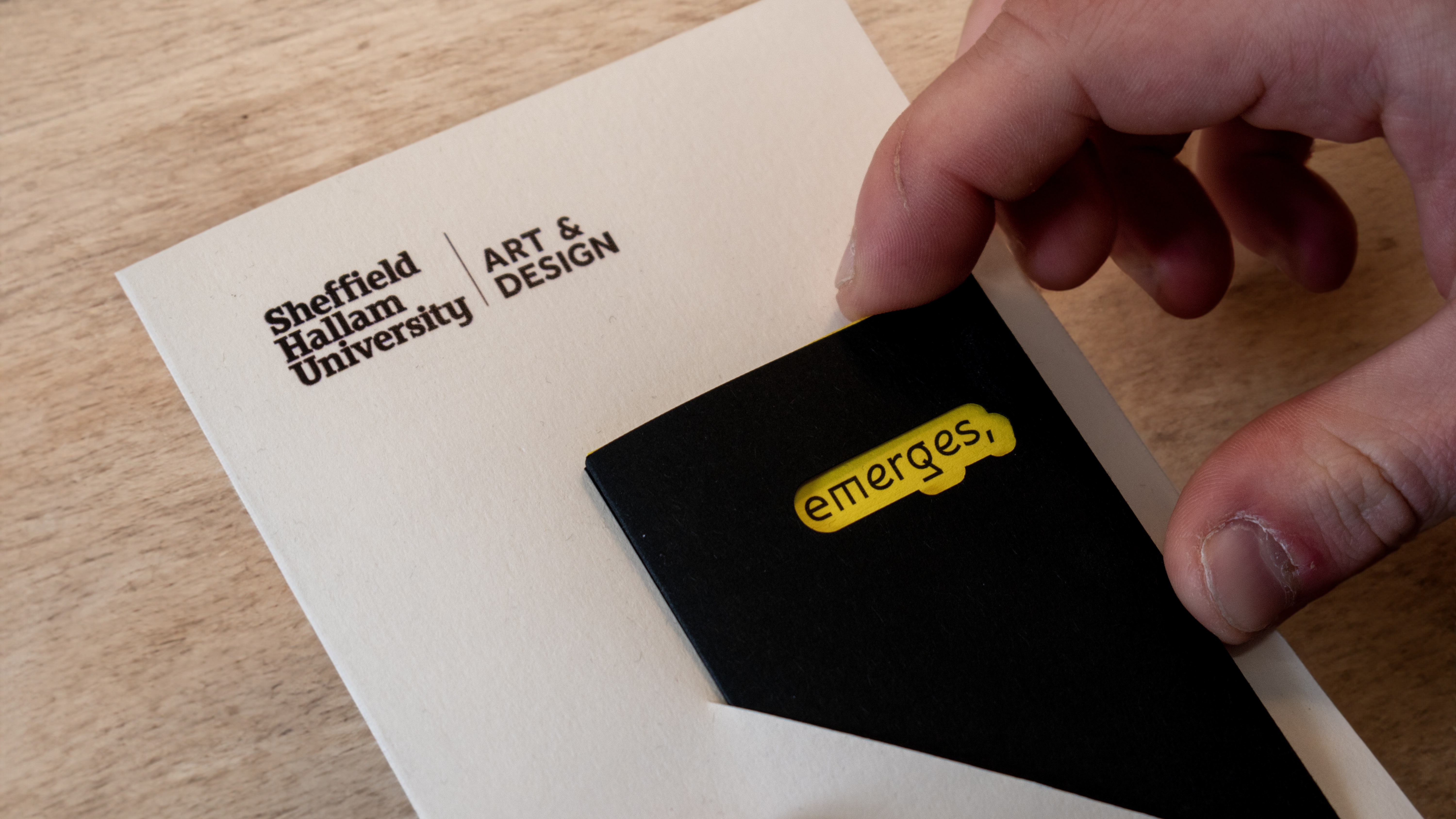
Working Documents & Research